| Release List | Reviews | Price Search | Shop | Newsletter | Forum | DVD Giveaways | Blu-Ray/ HD DVD | Advertise |

| Reviews & Columns |
|
Reviews DVD TV on DVD Blu-ray International DVDs Theatrical Reviews by Studio Video Games Features Collector Series DVDs Easter Egg Database Interviews DVD Talk TV DVD Talk Radio Feature Articles Columns Anime Talk DVD Savant HD Talk Horror DVDs Silent DVD
|
DVD Talk Forum |
|
|
| Resources |
|
DVD Price Search Customer Service #'s RCE Info Links |
|
Columns


|
 |
Color Experiments Part One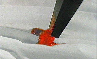 An Overview of Selected Color in B&W movies. 1998's Pleasantville fascinated audiences with its clever premise: the black-and-white fantasy world of a 50's television show being slowly transformed into color. What might have become a fairly lame extension of all those television commercials where digital effects allow the selective isolation and manipulation of color, Pleasantville's clever and pointed script turns the blossoming of its blandly cheerful world into a thoughtful exercise in imagination. The gimmick of seeing one perfectly hued person marooned in a completely monochromatic image became something more substantial as one searched for the rationale behind it all; the grace of Pleasantville is that a fairly sophisticated philosophy is being presented along with the comedy. Let's skip the TV commercials and instead look back at some film history to trace this 'Part-Color' experimentation. What we're specifically after are films that are predominantly B&W, yet have isolated color in them in one scene or another. First, there's the obvious case of movies made when color technology was being developed. Until two-strip Technicolor was used for entire features, scores of silent pictures had individual scenes with color, such as the masked ball sequence from the 1925 The Phantom of the Opera. In the sound period, Technicolor scenes were still being shot for many B&W films. The last scene of The House of Rothschild (Karloff in color!) and the final musical number in The Cat and the Fiddle are examples.
Filmmakers became more imaginative in the 1940s. Albert Lewin used a Technicolor insert of the frightening painting of the horribly degenerate and rotting Hurd Hatfield in The Picture of Dorian Gray, which never fails to produce a jump in the audience. The movie is B&W, and suddenly it occurs to you that you are looking at a color image. Lewin repeated the 'color painting in a B&W world' gimmick in his The Private Affairs of Bel-Ami, to slightly less effect. Here it's a painting of Hell that interrupts an otherwise conventional drama, and the shock fails to contribute much to the overall theme - if the color Hell in the painting is a metaphor for the social havoc Bel Ami's Machiavellian schemes create on Earth, well, it's something of a stretch. Lewin's The Moon and Sixpence does the same trick with a faux-Gaugin painting. If he wanted to be so consistent, perhaps he should have put a B&W shot into the all-Technicolor Pandora and the Flying Dutchman! Other 'color inserts' succeeded simply because their purpose was obvious. George Cukor's The Women included a full-color fashion show for its own sake. One wonders if the women who saw the film thought that MGM had just been too cheap to film the whole movie in color in the first place. In all of these examples the return to B&W is something of a letdown, like the curiously drab feeling imparted at the B&W finale of The Wizard of Oz. After seeing Lewin's color paintings, it seems odd to see them again in B&W, as if something were wrong. To Savant this is the sure sign a gimmick is at work. The color inserts are arresting, but they disrupt the dramatic line, functioning more as interruptions than enhancements to the movie. The staggeringly long, B&W Russian art film, Tarkovsky's Andrei Rublev (1968) succeeds because its ten-minute color insert is used as a finale. It shows an unbroken string of beautiful paintings that adds an understanding to the saga of the soul-searching artist we've been watching suffer for three hours. René Clément's B&W Is Paris Burning? concludes with an aerial celebration of the city that was spared by resistance fighters in 1944. Alfred Hitchcock got into the game back in Spellbound, his contribution to the 40's trend of literal-minded 'psychological' melodramas. After a number of gimmicky ideas, including a bonafide surreal dream sequence designed by Salvador Dali, Hitchcock ended his film with the spectacle of a killer's gun subjectively turning on the audience, and firing point-blank in our faces. This 'viewer suicide' was accompanied by one flash frame of the color red as the gun barrel fires. It's the perfect gimmick as the effect was almost subliminal! Perhaps the makers of 1958's Return of Dracula were thinking about Spellbound when they added a really brief color shot of blood gushing during a vampire-staking scene. Informed that MGM had released a video with a restored color 'ending', Savant was disappointed to find that the color surprise was not the imaginative and gory impalement that kills Dracula and ends the show. The color blood shot happens about five minutes earlier and goes by like a blip (see top of page). Its effect is negligible, considering that audiences were cheering at Technicolor blood gushing every which way in the same year's Horror of Dracula. Equally pointless were the color scenes added to three American-International monster movies of the drive-in variety. Herman Cohen possibly added color conclusions to I Was a Teenage Frankenstein and How to Make a Monster as a marketing scam: the posters could say 'See the shocking conclusion in COLOR' thereby committing minor fraud when the film screened was revealed to be nine-tenth's B&W. (note: the otherwise awful How to Make a Monster's Eastmancolor finale gives us an opportunity to see many of the cool rubber creations of monster-maker Paul Blaisdell in full color.) Bert I. Gordon did the same with his War of the Colossal Beast. Here almost the entire film is B&W, except for the very few seconds where the scarred giant electrocutes himself on those high tension lines next to Griffith Observatory. As always, look to Michael Powell if you want to see real innovation. He reversed the Oz B&W-Color scheme in his Film Blanc A Matter of Life and Death (U.S.: Stairway to Heaven) by making Earth Technicolor, and Heaven in B&W. The gimmick is fully developed and integrated; as in Pleasantville, there are shots where the two worlds intersect, most notably when a colossal B&W staircase comes right down into a color operating room. The most quoted gag from the film is the sly moment when a previously B&W French dandy lands on earth and admires a suddenly-crimson rose: "Ah, but we're starved for Technicolor in Heaven!". Some fairly high-powered Auteurs played with color inserts as well. Sam Fuller's Shock Corridor (1963) is notable in this regard. Much later Martin Scorsese inserted color 8mm home movies into 1980's Raging Bull; here the simple and appropriate effect was to represent aspects of boxer Jake LaMotta's life as they would appear in, well, home movies, like faded memories. 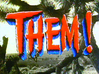
One bizarre use of color is in 1954's Them!. In some original prints, the main title that zooms up is printed in bright red! This isn't just a crazy thing done to the laserdisc version, where the red title has a bright blue drop. Savant saw a screening of the Warner studio print at the 1976 Filmex Science Fiction Marathon (at 4 in the morning). The story has it that director Gordon Douglas is responsible. Them! was originally planned to be in color and 3D. Filming in 3D was one of the main reasons that large puppet ants were decided upon as the main special effect. All the preproduction was done with 3D in mind, and then Warners cancelled the 3D. Just days before filming was to commence, Warner's ix-nayed the olor-cay as well. It might be a totally apocryphal part of the story, but I've been told director Douglas had the title colored in a few prints at his own expense, as a mild protest against the studio turning his A picture into something less prestigous. Even more apocryphal (mythical) are the color shots in The Manchurian Candidate even though I saw them with my own eyes, or at least I remember seeing them. It was screened at the Nuart theater in West LA, in about 1974 when both it and its co-feature, Peter Bogdanovich's Targets, were supposed to be out of circulation, so I believe the print being shown of Manchurian was Frankenheimer's own personal copy. Well, United Artists archivists tell me I'm mistaken, but I distinctly recall that when Laurence Harvey's girlfriend enters wearing a giant Queen of Diamonds costume, several shots had the diamonds printed in red! I even remember saying to my date that it wasn't working too well because they were trying to print red over black! Can anybody settle this Savant controversy? It was L.A., it was 1974, but I wasn't on drugs, honest. 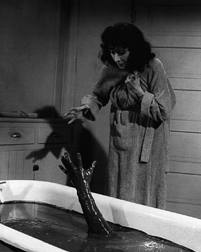
Psycho (but copying Les diaboliques), with a Castle twist. This brings us to William Castle's The Tingler (1959). The undisputed King of the Gimmickmeisters, Castle was officially touting his vibrating theater seat gag as Percepto. So audiences were taken completely by surprise in the scene where Judith Evelyn visits her medicine cabinet at midnight. When she turns to the bathtub, she finds it filled with scarlet blood, in full color! A blood-red dripping arm reaches up at her, even though she remains in B&W! Castle's cameraman produced the effect of the isolated color blood in a B&W bathroom very effectively, long before the digital imagery of Pleasantville was anything but a dream. When the bathroom light switches on, the film stock changes from B&W to Eastmancolor. Everything in the set was either white or painted gray or black; actress Evelyn wears gray makeup on her arms and face. Calling the effect startling doesn't do it justice; in 1959 little like it had been seen before. People screamed bloody murder! For those who have seen The Tingler on cable or home video, these prints attempted to restore the color to the scene with a 16mm print; the quality drop is pretty apparent. Sony/Tristar archivists newly mastering this film to HDTV found the original negative had faded ... even the 'B&W' area of the image in this scene has faded to magenta, making accurate color timing (separating red from red) a real problem. Expect The Tingler on DVD sooner than later ... a featurette has already been completed for it. (5/24/99) The Tingler's color bloodbath was a perfect use for a shocking illusion. It seems to have been imitated the very next year in a French horror film by Roger Vadim of 1960, Et mourir de plaisir (literally, 'And Die of Pleasure'; U.S.: Blood and Roses). This quality reworking of the Sheridan Le Fanu Carmilla tale was sadly hacked to bits by censors, leaving one wondering at what remains. Rare photos exist of a censored image, a horrifying one-eyed blob-like protoplasmic vampire feasting on Elsa Martinelli's torso. But still remaining is a vampire-vision dream sequence designed in B&W with bizarre colored highlights. As cinema the scene is too symbolic and literal, too art-film to work well. Yet there are images (by cinematographer Claude Renoir?) that dazzle, even if they seem to be cribbed from a Cocteau film. The optical mixing of color and monochrome looks good even by Pleasantville standards. Et mourir de plaisir is a major candidate for restoration, Paramount! I end with Akira Kurosawa's black and white film High and Low because it is an antecedent to Schindler's List, the subject of Part 2 of this Color Experiment article. The use of color in High and Low is an effective solution to a sticky problem: a kidnapper's ransom is delivered in a trick suitcase. If the kidnapper burns the case, it will release volumes of colored smoke and help lead the police to an arrest. In a B&W movie, who can tell what color smoke is? Kurosawa had the single shot with the smoke hand-tinted pink. As Savant will attempt to show in Color Experiments, Part 2, Steven Spielberg turns a color gimmick into real cinema, in Schindler's List. Text © Copyright 1999 Glenn Erickson
Review Staff | About DVD Talk | Newsletter Subscribe | Join DVD Talk Forum |
|

| Release List | Reviews | Price Search | Shop | SUBSCRIBE | Forum | DVD Giveaways | Blu-Ray/ HD DVD | Advertise |