
| Reviews & Columns |
|
Reviews DVD TV on DVD Blu-ray 4K UHD International DVDs In Theaters Reviews by Studio Video Games Features Collector Series DVDs Easter Egg Database Interviews DVD Talk Radio Feature Articles Columns Anime Talk DVD Savant Horror DVDs The M.O.D. Squad Art House HD Talk Silent DVD
|
DVD Talk Forum |
|
|
| Resources |
|
DVD Price Search Customer Service #'s RCE Info Links |
|
Columns

 
|
|
|
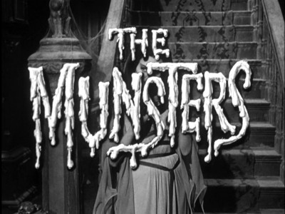
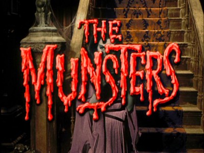
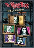
Munsters: ''Family Portrait'' in Full Color, The
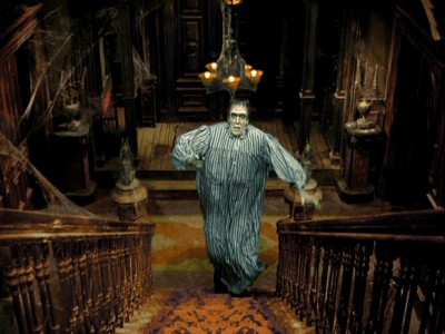
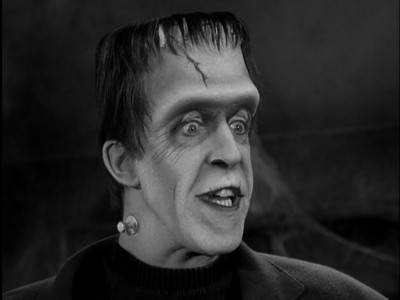
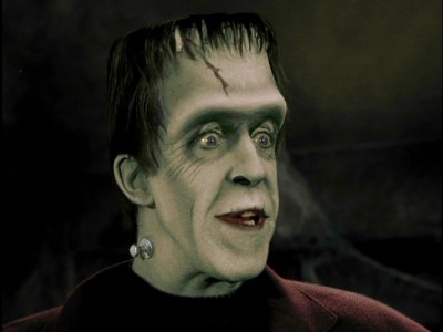
In what I assume can only be a trial balloon for colorizing the entire series, Universal has released The Munsters: "Family Portrait" in Full Color, which features the first digitally colorized version of a Munsters episode, Family Portrait, as well as the original black and white transfer. Whether or not you'll want to purchase this disc would depend on your devotion to owning everything connected with this classic sitcom, and whether or not the idea of colorizing classic black and white TV shows and movies is acceptable to you.
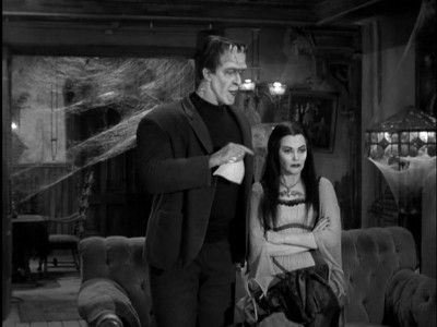
As much as I'd love to take this opportunity to go on and on for paragraphs about one of my favorite sitcoms from childhood (and today, quite frankly), I don't think that would serve the purpose of this review. Suffice it to say, The Munsters, a broad, hilarious parody of the "average American family" sitcom, as filtered through the rich, heady semiology of Universal classic monster movie mythology, features a comedy team (Fred Gwyne's Herman Munster and Al Lewis' Grandpa) that ranks right up there in the Top Ten television comedy duos of all time. With utterly sublime comedic timing between the two, along with an outsized, Borscht Belt, vaudevillian sensibility to their patter, Gwyne's and Lewis' turns as childish, petulant, criminally dense Herman and wickedly smart-assed, cranky, indignant Grandpa, elevate the team into the ranks of Gleason and Carney, Klugman and Randall, and Benny and Rochester. I can point, unequivocally, to a scene in Hot Rod Herman where Herman asks if Grandpa isn't going to wish him good luck with his drag race, and Grandpa replying - with absolute indifference - to "Drop dead!" as my single favorite comedy moment in TV history.
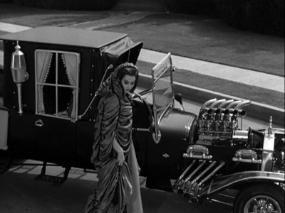
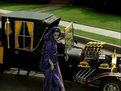
That being said, what is one to make of this colorized effort of a single episode, Family Portrait, the 13th episode of the first season, featuring the last appearance of the first (and best) Marilyn, the lovely, sweet Beverly Owen? It's surprisingly difficult to say, actually. Perhaps I'm mellowing as technology becomes more of a post-release option for filmmakers and studios, but I can't say I minded too much the colorizing of this episode. Now I can already hear the cries of, "Sacrilege!" from both die-hard fans of the show who detest anyone monkeying with their classic, as well as absolute purists who decry colorizing as a defilement of all that is right and good about black and white movies. I hear you, and I sympathize. I was there myself, as well. When colorizing first came out, I thought it was akin to child molestation. Why the hell would Ted Turner want to colorize Casablanca? It made no sense artistically, and the results, with the first wave of colorizing technology, were hilariously coarse.
As well, who wants to have their early, beloved, black and white movie and TV experiences wiped out by garishly splashing color all over them? I grew up during a time when a lot of people still experienced all of their TV in black and white (due to the exorbitant cost of color sets), so the ghostly grays and whites and blacks of a darkened room with a TV set on, is a cherished memory for me. Now that I can see all my old TV favorites in their original color (Gilligan's Island continues to be a revelation to me, just from the standpoint of its vivid comic-book coloring), why would I want to see The Munsters, originally filmed in glorious chiaroscuro black and white, in color?
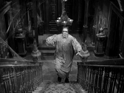
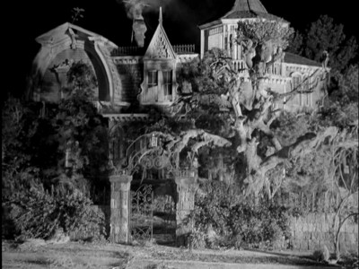
Well...I don't want to see it in color. I prefer the black and white. That's how it was shot, and that's how it looks best. If you believe the series connects directly with the old Universal "classic monster" movies that enjoyed a huge revival in the early-to-mid 60s in comic books, TV reruns, models, magazines and paperbacks, then black and white is the only answer as to how The Munsters works. It has to be in black and white. So why didn't the colorizing bother me so much in this case? Probably the main factor would be that the original series has been available for decades in black and white, including full DVD sets of the series, and there seems little chance of those black and white versions going away (if you remember, when colorizing first came out, the main argument against it was that the original black and white versions of classic films would disappear - that never happened). As well, I believe that most people who grew up on the show, and who want to enjoy it now for themselves or who want to share it with their kids, will prefer the black and white, anyhow. That's a big part of the show's amusement factor: it looks like something that crept out of the Universal vault from the 1930s.
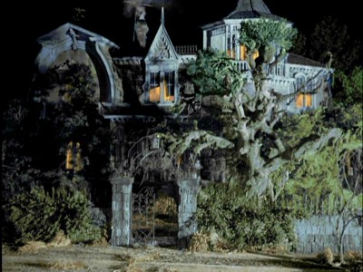
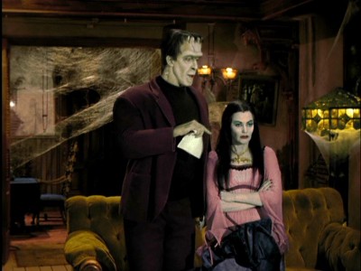
Additionally, even though the colorizing process still doesn't come close to accurately recreating flesh tones (or any other tones, for that matter, when compared to true color cinematography), that deficiency in reproduction actually works for this application to The Munsters. Comparing the colorizing of Family Portrait to the first true color representation (not counting the original color pilot) of The Munsters, in the Technicolor theatrical release, Munster, Go Home!, is like putting up a 40 watt bulb next to a supernova. There's no comparison to the dingy, greenish-hued coloring of the digital colorization process, and the incredibly rich, saturated look of the feature film. However, looking at the colorized Family Portrait, those technical limitations (which I know now, courtesy of Barry Sandrew of Legend Films, was intentional) gave the episode an equally "vintage" look, reminding me of early two-color and two-strip Technicolor processes. The colorizing for this Munsters episode "works" because it has been tuned to the product with sensitivity to the product's original aesthetic. The color reproduction isn't "true," but that makes the show look as much like an old color horror film as say, Chaney's The Phantom of the Opera (or at least, how those old color films look now, after decades of deterioration).
And perhaps most importantly, it was kind of fun going back and forth, and seeing what the sets and the makeup might have looked like in reality, when the show was shooting. Some of the fine detail of the set decoration is more readily apparent in the colorized process - not because it's not there in the black and white original (in fact, some may claim that the colorizing process actually blurs minute, fine detail), but because it's so much bolder in the colorized. What you looked at for years in black and white, and didn't really see because your eye tended to wash over all the gray tones, leaps out in the colorized version (such as the pattern on the Munsters' carpeting). Again, it's not that the color version is "better," just "different." It won't replace the old black and whites.
The DVD:
The Video:
I discussed in detail above the look of the transfers for this colorized (and the included original black and white) version of Family Portrait. No digital clean-up of the actual image has been attempted (I still saw screen anomalies such as white spots and scratches that were on the original season release transfers), but they still look quite good.
The Audio:
The Dolby Digital English 2.0 mono is loud, clear and thoroughly in keeping with the original sound design of the series. All dialogue is crisp and clean. English, French and Spanish subtitles are available, as well as close-captions.
The Extras:
There are no extras for The Munsters: "Family Portrait" in Full Color.
Final Thoughts:
A trial balloon sent up to see if fans will support a colorized Munsters. I prefer the black and white look of The Munsters, but oddly, the colorizing technique used for this first season episode reminded me of very early two-color film processes, and thus worked in a strange way in keeping The Munsters looking vintage. It's fun to compare the two looks, as well, to see if you can pick out any detail you may have missed among the original gray tones. Hard-core Munster fans won't need a recommendation from me: they'll buy this. A rental may be best to see if you can tolerate the colorizing, and because Universal only saw fit to colorize one episode (with zero extras) - maybe not the best marketing move in getting people to pony up dough for an experiment. But I'm going to go ahead and recommend The Munsters: "Family Portrait" in Full Color.
Paul Mavis is an internationally published film and television historian, a member of the Online Film Critics Society, and the author of The Espionage Filmography.
Email from Barry Sandrew
Hi Paul,
Thank you for the review of our colorized version of The Munsters "Family Portrait". Our design was indeed, not intended to simulate a technicolor look but to create a stylized color pallete that fit the underlying gray scale element. The Munsters environments were all very saturated, almost to the point of a comic book look (which it is) and the normal people environments (restaurant, office, etc) were treated normally. I hope you feel, given the intent of the design that we succeeded.

|


| Popular Reviews |
| Sponsored Links |
|
|
| Sponsored Links |
|
|
| Release List | Reviews | Shop | Newsletter | Forum | DVD Giveaways | Blu-Ray | Advertise |
|
Copyright 2024 DVDTalk.com All Rights Reserved. Legal Info, Privacy Policy, Terms of Use,
Manage Preferences,
Your Privacy Choices | |||||||