| Release List | Reviews | Price Search | Shop | Newsletter | Forum | DVD Giveaways | Blu-Ray/ HD DVD | Advertise |

| Reviews & Columns |
|
Reviews DVD TV on DVD Blu-ray International DVDs Theatrical Reviews by Studio Video Games Features Collector Series DVDs Easter Egg Database Interviews DVD Talk TV DVD Talk Radio Feature Articles Columns Anime Talk DVD Savant HD Talk Horror DVDs Silent DVD
|
DVD Talk Forum |
|
|
| Resources |
|
DVD Price Search Customer Service #'s RCE Info Links |
|
Columns


|
 |
The Color of Peter Pan |
|
|
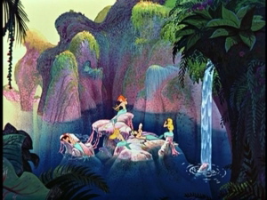
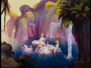
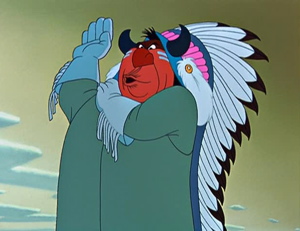
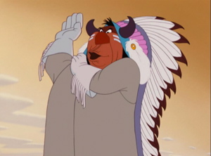
Peter Pan's tunic is at times almost goldenrod instead of Lincoln green. There is no true blue sky, just a variant of Egyptian Blue. Neverland sometimes looks like your lazy neighbour's parched garden. The skies are often milky white or beige. The red and blue wallpaper in the Darling children's bedroom is now brownish. Mermaid Lagoon has lost its greenery and turned a repulsive pink ... The funny thing is, once you accept that the action takes place in Neverland in the fall, with lots of brown, yellow and orange leaves everywhere, you sort of learn to like it. It's a wild, one might say "experimental", concept. It's also a radical revision of the film's look.
On the downside, the Redskins have turned a politically correct pink. On the plus side, every brown and yellow surface is made to shine unnaturally, even at night, and lots of things are visible in the dark that weren't before. The reverse is true in the daytime.
More revisionism: I noticed that a slight shimmy in the London cityscape at night just before the camera pans up to Neverland has been eliminated in this version. Can they do that?
|
|
In the indoor scenes, this slant towards yellow makes sense as it replicates the warm, nostalgic, homey glow of lamplight. Otherwise... The best thing I can say is that it gives the viewer a brand new (though some might say old-fashioned) perspective on a film he's seen maybe too often. The total effect is somewhat reminiscent of a yellowed full-colour illustration in an old picture book. A quick look at the numerous Art Galleries in the extras will remind you that there should have been a whole lot more green and blue everywhere according to the original artwork.
Considering the radical changes made to the colour palette, maybe they could have called this the "Golden Slumbers Edition", the "Pixie Dust Edition" or, better still the "Global Warming Edition"... And it's not something you can correct with the Tint button (which adds red or green) or with the Cold setting (which adds a little blue). But it's perfect if improved sound is important to you, if you have no memories of what "Peter Pan" used to look like or if you really pictured Hook's harpsichord as being made of solid gold. -- Benoît A. Racine
Back to DVD Savant: I've heard about some Disney animation being digitally re-colored for video but have never really seen hard examples of the changes. The Peter Pan screen grabs provided by Benoît grabbed me.
DVD Savant is NOT a site devoted to version comparison and does not set itself up to wag irate fingers at DVD companies, at least not as a standard practice. When something irks me, I'll squawk, as I did with a Pan-Scan transfer several years back on Castle Keep. I don't think it's necessary to staff film restoration companies with monks sworn to replicate every nuance of original theatrical presentations, but a reasonable respect for what a film once was is certainly appreciated.
I'm sure that Peter Pan looks quite attractive in its new GoldenVision look, but I think I'd rather stick with the earlier disc, with its full original color range.
Reader Responses:
"Glenn, Your note on the color of Peter Pan prompted me to dig out my 45th Anniversary edition LaserDisc of the same title.
Let me start by saying I believe, since Disney owns the rights to this property they can do anything they want to it. If they wish to take the original cameral negatives and cut them into guitar picks, it's their perrogative to do so. I'm not one to say they owe the viewing public anything because of previous releases. Same goes for Lucas and Star Wars.
Nonetheless, I think my laserdisc falls between the two DVDs you feature in your article. The laser is probably closer in hue to 2002 edition DVD but also closer to the new one in brightness & saturation. Interestingly, this laser was issued in 1998 and must belong to the very last generation of laserdicscs ever pressed. This is one reason I continue to say, "You can have my laserdisc player when you pry it from my cold, dead fingers."
The good news is, I can now create a DVD-R backup that's indistinguishable from the original laser. (I was an early-adopter home theatre buff way before DVD, using LD into a line multiplier with a Sony CRT projector and a 100" screen. If I can't see a difference, there isn't a difference.)" -- D. M. Arnold 3.27.07
"Hello Glenn, my two cents on the Peter Pan thing: There's always some degree of interpretation when something is remastered, but Disney has been well documented as not really having "the original look" foremost in their mind. They want it to look ultra-bitchen-cool on a wall screen plasma, no original film artifacts, thanks. And if the original color scheme can be "improved" upon for a more "contemporary" look, whyyyyyy not? The 2002 grabs look right to me, and is the way I've always remembered it.
I used to have a 16mm trailer, and the color palate was predominantly green. And the "redskins" really are a giveaway ... they NEVER looked like that, I'll bet on it. Anyway, get ready to draw flak on this one. --- (name withheld) 3.27.07
Review Staff | About DVD Talk | Newsletter Subscribe | Join DVD Talk Forum
Copyright © MH Sub I, LLC dba Internet Brands. | Privacy Policy | Terms of Use
|

| Release List | Reviews | Price Search | Shop | SUBSCRIBE | Forum | DVD Giveaways | Blu-Ray/ HD DVD | Advertise |