
| Reviews & Columns |
|
Reviews DVD TV on DVD Blu-ray 4K UHD International DVDs In Theaters Reviews by Studio Video Games Features Collector Series DVDs Easter Egg Database Interviews DVD Talk Radio Feature Articles Columns Anime Talk DVD Savant Horror DVDs The M.O.D. Squad Art House HD Talk Silent DVD
|
DVD Talk Forum |
|
|
| Resources |
|
DVD Price Search Customer Service #'s RCE Info Links |
|
Columns

|
|
|
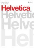
Helvetica
A documentary about a typeface? Surely it must be some sort of a joke. Just the notion of it sounds as boring as watching a documentary about ... um, well ... typeface. But Gary Hustwit's Helvetica is deceptively seductive, a smart and quirky work that lifts the veneer of innocuity on the world's most ubiquitous lettering.
Helvetica, in fact, is the most impressive type of documentary. It introduces audiences to -- and immerses them in -- a decidedly eclectic subject about which they aren't likely to know much beforehand. And yet the film deftly reveals the hidden power of typeface as well as its artistic and propagandistic implications.
Designed at the Haas Type Foundry in Münchenstein, Switzerland, Helvetica (a quasi-invented term that means the "Swiss typeface") swept the globe shortly after its unveiling in 1957. Its cold simplicity conveyed authority and casual elegance, and it quickly became the typeface of choice for corporations and governmental entities everywhere.
Hustwit interviews a number of typeface designers and related experts who attest to Helvetica's strangely malleable appeal. People could ascribe any sort of trait to the lettering. It was deemed alternately ordinary and exceptional, plain and fancy, folksy and fascist, all depending on the specific baggage you brought to the mix.
In the Sixties and Seventies, Helvetica was embraced as a breath of fresh air -- or, as one interviewee puts it, a refreshing glass of water for people emerging from a desert -- particularly in the world of corporate branding. Crate & Barrel and American Airlines are but a few businesses to use the no-frills typeface in their branding. By the Eighties, however, detractors equated Helvetica with blind conformity. Graphic designer Paula Scher likens it to the typeface of the Vietnam War.
This isn't a glitzy doc, by any stretch -- and comes close to outstaying its welcome, even at a taut 80 minutes -- but Helvetica is often fascinating. Hustwit, who produced several documentaries on alt-rock mainstays Wilco and Death Cab for Cutie, finds a sort of rhythmic grace in the insights of his interview subjects. You might not share their passion for typeface, but you're bound to be awed by it. In so doing, the documentary looks past the mundane to rediscover what makes the world so compelling.
The DVDThe Video:
Shot in high-definition video, Helvetica boasts a clear, clean picture quality with solid details and realistic skin tones. Presented in 1.85:1 anamorphic widescreen.
The Audio:The Dolby Digital 2.0 audio is perfectly suitable for this interview-driven documentary. Subtitles are in English and German.
Extras:If the documentary doesn't fully satiate your appetite for knowledge, you're in luck. The DVD includes more than an hour and 35 minutes of additional interviews with the experts who appear in Helvetica: Massimo Vignelli, Wim Crouwel, Matthew Carter, Mike Parker, Otmar Hoefer & Bruno Steinert, Hermann Zapf, Hoefer & Frere-Jones, Erik Spiekermann, Neville Brody, Michael Bierut, Paula Scher, Stefan Sagmeister, David Carson, Experimental Jetset, Michael C. Place, Norm and Rick Poynar.
Final Thoughts:Focused and beautifully crafted, Helvetica is a solid doc that forces you to reexamine the crushingly familiar by offering viewers an entirely new prism.
|


| Popular Reviews |
| Sponsored Links |
|
|
| Sponsored Links |
|
|
| Release List | Reviews | Shop | Newsletter | Forum | DVD Giveaways | Blu-Ray | Advertise |
|
Copyright 2024 DVDTalk.com All Rights Reserved. Legal Info, Privacy Policy, Terms of Use,
Manage Preferences,
Your Privacy Choices | |||||||